A mockup of a screenshot from SAS (reduced due to NDA Agreement)
Consumption Time
Dashboard
Brief
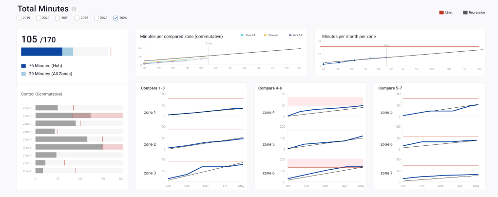
A usage-time dashboard designed to provide an overview of minutes as the primary unit for a specific team. The concept was to project the outcome for the next quarter using a regression line and a limit line, allowing the point where they intersect to indicate when the limit may be reached.
The challenge: designing a unified, accurate solution that accommodated diverse team structures through flexible filtering and sorting, without compromising data integrity. 6 weeks sprint.
A mockup of a screenshot from SAS (reduced due to NDA Agreement)
The Solution
This solution leverages a modular dashboard layout that balances high-level aggregate KPIs with granular, side-by-side zone comparisons, using clean regression trends and clear visual thresholds to make predictive data immediately actionable for any team configuration.
Colour Palette: based on team’s Design System.
I am a Senior UX & Data Visualisation Designer with 10+ years of experience transforming complex metrics into intuitive, human-centric interfaces.
A decade of UX practice, now focused on one question: how does data actually feel to the people reading it?
Currently a PhD researcher at the University of Portsmouth, my research explores how data visualisation can enhance understanding and engagement among individuals living with diabetes. My work investigates how data visualisation can bridge cold clinical metrics and the deeply lived experience of managing diabetes, transforming them into visual narratives that alter how individuals perceive and emotionally connect with data. Ultimately, my research aims to reframe data not just as a tool for analytical efficiency, but as a powerful, relatable medium for storytelling, connection, and personal insight.
Contact