Performance Overview
Dashboard
Brief
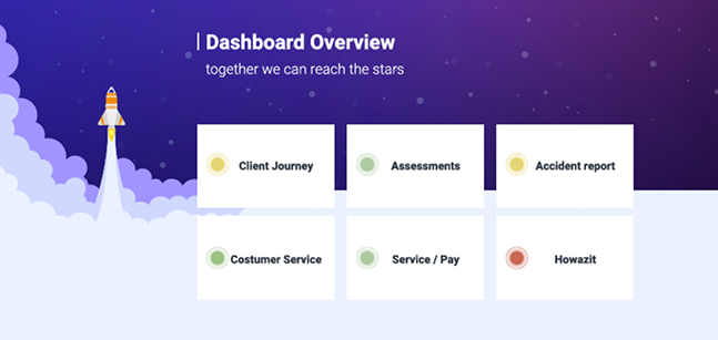
An overview that serves as a launchpad to all six dashboards related to customer service. The traffic-light colors indicate the urgency of each dashboard to review.
The Solution
The solution delivers a high-impact overview that functions as a central launchpad for all six customer service dashboards, optimized for low cognitive load and continuous display on a dedicated screen. By utilizing a highly intuitive traffic-light color system, the interface instantly signals the urgency of required reviews at a glance. The layout balances high-level visibility with functional efficiency, allowing users to monitor critical operations effortlessly while maintaining immediate, single-click access to deeper, detailed analytics dashboards.
I am a Senior UX & Data Visualisation Designer with 10+ years of experience transforming complex metrics into intuitive, human-centric interfaces.
A decade of UX practice, now focused on one question: how does data actually feel to the people reading it?
Currently a PhD researcher at the University of Portsmouth, my research explores how data visualisation can enhance understanding and engagement among individuals living with diabetes. My work investigates how data visualisation can bridge cold clinical metrics and the deeply lived experience of managing diabetes, transforming them into visual narratives that alter how individuals perceive and emotionally connect with data. Ultimately, my research aims to reframe data not just as a tool for analytical efficiency, but as a powerful, relatable medium for storytelling, connection, and personal insight.
Contact