Portsmouth’s
Pattern
Brief
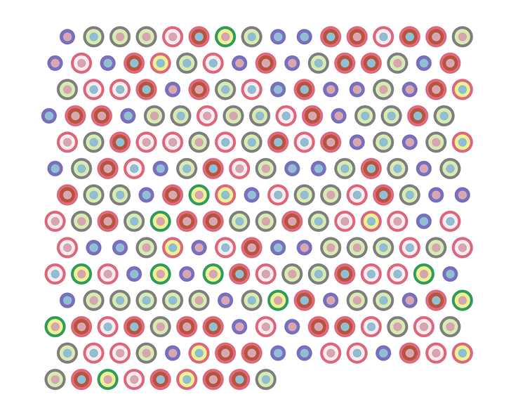
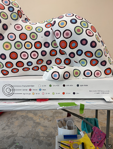
This was a concept design submitted and later selected to be commissioned by the council as part of the public art trail. A data visualisation design representing a population divided into three categories, showing their proportions without using numbers. The distribution is conveyed intuitively through visual perception.
View project
The journey
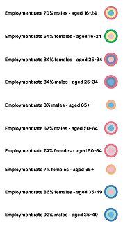
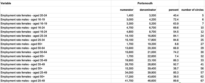
I performed a detailed review of the 2021 Census data (95% confidence level), examining and analysing various cross-sections of the dataset. Using a standardised factor, I calculated the specific number of circles required for each data point to ensure visual consistency.
Transformation
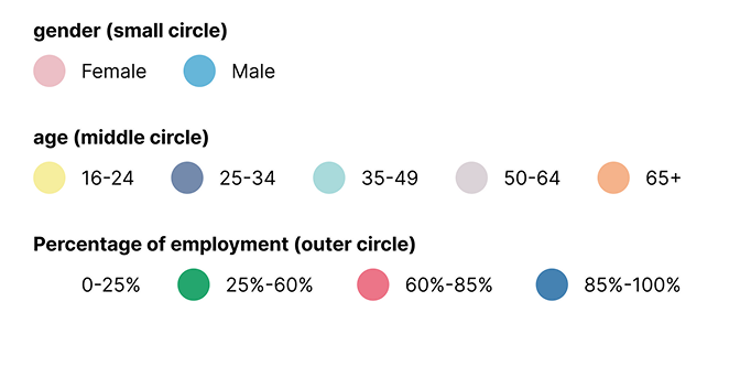
Each category was assigned a distinct colour and scaled proportionally to the size of the circle.
Development
Developing the Visual Units: with the legend defined, I proceeded to stack the data layers and generate the proportional circle elements.
The outcome
A structured 21×21 grid where the number of circles represents proportional data values. By omitting traditional percentages and numbers, the design invites the viewer to explore the dataset and discover patterns intuitively.
Note: at that time, the sponsors for this project requested a colour change.
I am a Senior UX & Data Visualisation Designer with 10+ years of experience transforming complex metrics into intuitive, human-centric interfaces.
A decade of UX practice, now focused on one question: how does data actually feel to the people reading it?
Currently a PhD researcher at the University of Portsmouth, my research explores how data visualisation can enhance understanding and engagement among individuals living with diabetes. My work investigates how data visualisation can bridge cold clinical metrics and the deeply lived experience of managing diabetes, transforming them into visual narratives that alter how individuals perceive and emotionally connect with data. Ultimately, my research aims to reframe data not just as a tool for analytical efficiency, but as a powerful, relatable medium for storytelling, connection, and personal insight.
Contact