Work / Monitoring Dashboard

Monitoring

Dashboard

Client

VerticalField

Year

2020

Role

UX Designer

Type

Documentation

Tools

Figma | XD | HTML

Brief

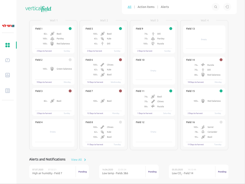
Create a centralised analytics ecosystem that transforms fragmented, multi-source data streams into a cohesive and intuitive visual interface. The platform must deliver real-time data accuracy (near online), allow users to seamlessly transition from macro-overviews to micro-details via interactive drilldowns, and dynamically adapt its workspace layout based on user roles and permissions.

Close-up of fresh lettuce grown in a VerticalField wall — the crop this system was built to monitor
VerticalField monitoring dashboard with Wall 1–4 field status cards and alerts

The Solution

The solution manages dense, multi-source data by establishing a strict visual hierarchy that uses progressive disclosure to surface critical insights first without causing dashboard fatigue. To handle high-frequency, real-time updates, it utilises smooth UI transitions that protect the user's active focus from disruptive layout shifts. Deep analytical drilldowns are made seamless through persistent breadcrumbs and sticky filtering parameters that ensure macro-context is never lost. Finally, it balances customisation and structure with a role-based engine, allowing power users to configure modular widgets while maintaining clean, predictable defaults for casual users.

I am a Senior UX & Data Visualisation Designer with 10+ years of experience transforming complex metrics into intuitive, human-centric interfaces.

A decade of UX practice, now focused on one question: how does data actually feel to the people reading it?

Currently a PhD researcher at the University of Portsmouth, my research explores how data visualisation can enhance understanding and engagement among individuals living with diabetes. My work investigates how data visualisation can bridge cold clinical metrics and the deeply lived experience of managing diabetes, transforming them into visual narratives that alter how individuals perceive and emotionally connect with data. Ultimately, my research aims to reframe data not just as a tool for analytical efficiency, but as a powerful, relatable medium for storytelling, connection, and personal insight.

More Work

Consumption Time Dashboard

IEC Company · 2024

Performance Overview Dashboard

IEC Company · 2025

Clinician Overview (UX/UI)

Carelane · 2021

Portsmouth’s Pattern

Portsmouth City Council · 2026

Contact