Five projects, Five stories.
Selected Work - some projects are covered by NDA agreements and presented in a simplified form
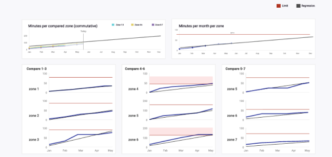
Consumption Time Dashboard
A usage-time dashboard designed to provide an overview for a specific team. The concept was to project the outcome for the next quarter using a regression line and a limit line, allowing the point where they intersect to indicate when or if the limit may be reached.
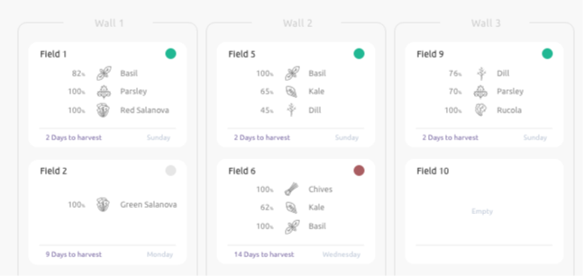
Monitoring Dashboard
Designed for tablet use next to the growing walls, this monitoring dashboard manages Vertical Field's indoor supermarket warehouse systems, tracking up to 16 distinct fields growing up to three custom crops each.
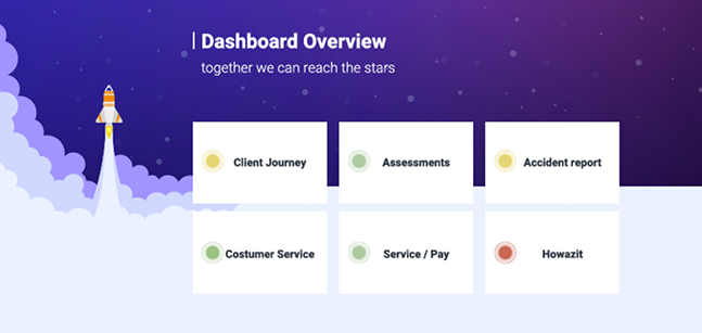
Performance Overview Dashboard
An overview that serves as a launchpad to all six dashboards related to customer service. The traffic-light colors indicate the urgency of each dashboard to review.
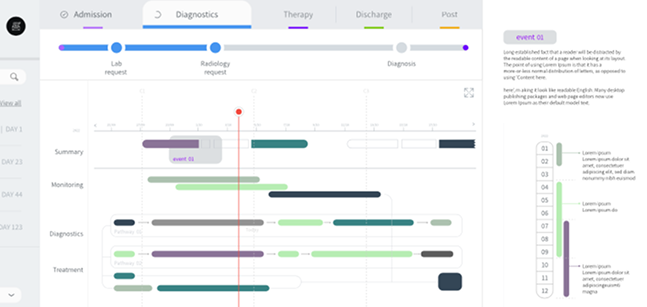
Clinician Overview (UX/UI)
Carelane supports doctors and patients involved in clinical trials. This dashboard provides a clear overview of a patient's progress, mapping out completed milestones and upcoming steps in the trial lifecycle.
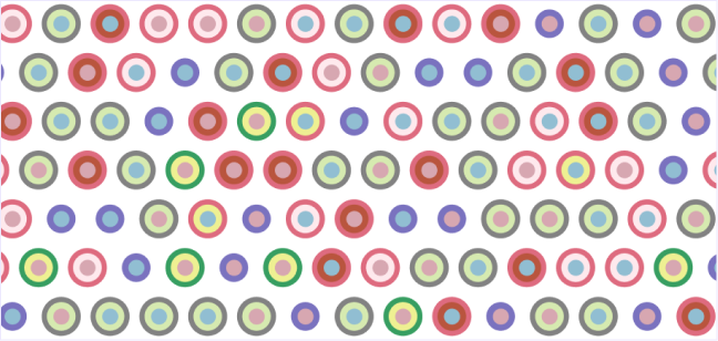
Portsmouth’s Pattern
A data visualisation design representing a population divided into three categories, showing their proportions without using numbers. The design was commissioned to be part of the art trail.